
 Hiya, ok, I created more white space. It took finagling, so most of the changes are subtle. But they made a huge difference, at least to me; the overall visual flow seems to evoke magic, though maybe I am deluded after all the hours I’ve spent on this. And if that flow is there, maybe I didn’t notice it before, objectivity is so hard.
I also fixed the paragraph that I was worried might seem bio instead of book description (it starts “Mystic and poet,”) and fixed a few other things. Still need to proof it against the original text file. I wish I could put the blurbs in a different font but all the ones I tried did not work.
I put up this newer version below in case anyone still wants to give feedback, which I would love. Old publishing saw: The more eyes looking at it, the better. Below the cover is your reward: Another pic of my cute kitty.
Oh, the back might not make sense if you haven’t seen the front, which is here.

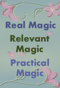
Unproofed back cover. The cover does not have a gray border, I put that there to distinguish it from the rest of the blog.

And I am now going to eat lunch, woohoo! Thanks!


A couple of suggestions…
1) I might consider switching the order of the two paragraphs starting “Beautifully homemade…” and “Sprinkling Faerie…” It seems to me that, after reading the first three bits at the top, people are ready for a fuller explanation of, ‘So, what’s this I’m holding?’ (or considering online). Then, after reading that, the wonderful detail of it being beautifully handmade, etc. flows more as an immediate first example of the fruits of the philosophy and methodology – why, of course! If the handmade comes first, it reads a teensy bit as an apology or a justification instead of an important point. And if someone is reading the back cover with the book already in their hands, as will happen many times in kitchens, bathrooms and bedrooms across the world, they already know it is beautifully handmade, because, well, it is.
2) At the end, the line about it being a continuation of 3rd road and Another Step seems to ever so slightly contradict the preceding paragraph… which tells the reader that this book is a fruit of experience than a presentation of a belief system. For people who don’t know what 3rd road and another step are, it is too little information, and for people who do, they probably already know what the line says. I think the impulse for putting the line there might be the way, in your class announcements, you make a point of letting people know how this particular class relates to all the other ones, but here on the back page, I kinda don’t think you need that. Probably elsewhere in the book you say similar things (?), and here, maybe you just express the same subtly through more sweet whitespace… hee hee!
Just thoughts…
Mordred, great points, thank you!!! Your feedback is clearly based in thoughtful analysis. And I thought the same thing re the contradiction between no dogma and more third road, since people do not know that third road and Another Step focus on immersing the student in their own reality. Hm, maybe I shld add that to the cover, if there is space. Hm… I always enjoy yr ideas so much, my dear fellow traveler, thanks again!